ATS & CV Formatting
How 2-Column Resumes Break ATS Parsers
The two-column CV layout looks clean and space-efficient. What it actually does is scramble your work history into nonsense when an ATS parser processes it. Here is the technical reason why, and what your CV structure should look like instead.
Two-column CV layouts cause ATS parsers to read your content in the wrong order, merging your left and right columns into a single garbled stream of text. Instead of “Software Engineer at XYZ Corp, 2020 to 2024,” the parser may store something like “Software Engineer Python JavaScript AWS at XYZ Corp React Node.” Your job titles, companies, dates, and skills get mixed up or attributed incorrectly. The fix is a single-column layout: every section runs top to bottom in one continuous flow. Single-column CVs parse reliably on every ATS platform used by employers in the UAE and India. ApplyIn5 generates single-column, ATS-optimised CVs by default, so the structure is never a point of failure.
How ATS parsers actually read a PDF or DOCX
Most people assume an ATS reads a CV the way a human does: top to bottom, left to right, with an intuitive understanding of visual layout. This assumption is wrong, and it is the root of most formatting-related application failures.
An ATS parser does not see your CV. It processes the underlying file structure. For a PDF, it extracts text from the content stream in the order the text objects were placed into the file by the software that created it. For a DOCX, it reads the XML structure of the document, processing text runs in document order.
A human reading a two-column page understands intuitively that the left column and right column are separate units of information. The human eye follows each column vertically. An ATS parser has no concept of visual columns. It processes text in the order it appears in the file’s underlying data, which for a designed two-column document is often horizontal: the first text element on line one of the left column, then the first text element on line one of the right column, then line two of the left, then line two of the right. The visual layout and the data order are completely different.
What happens to a two-column CV during parsing
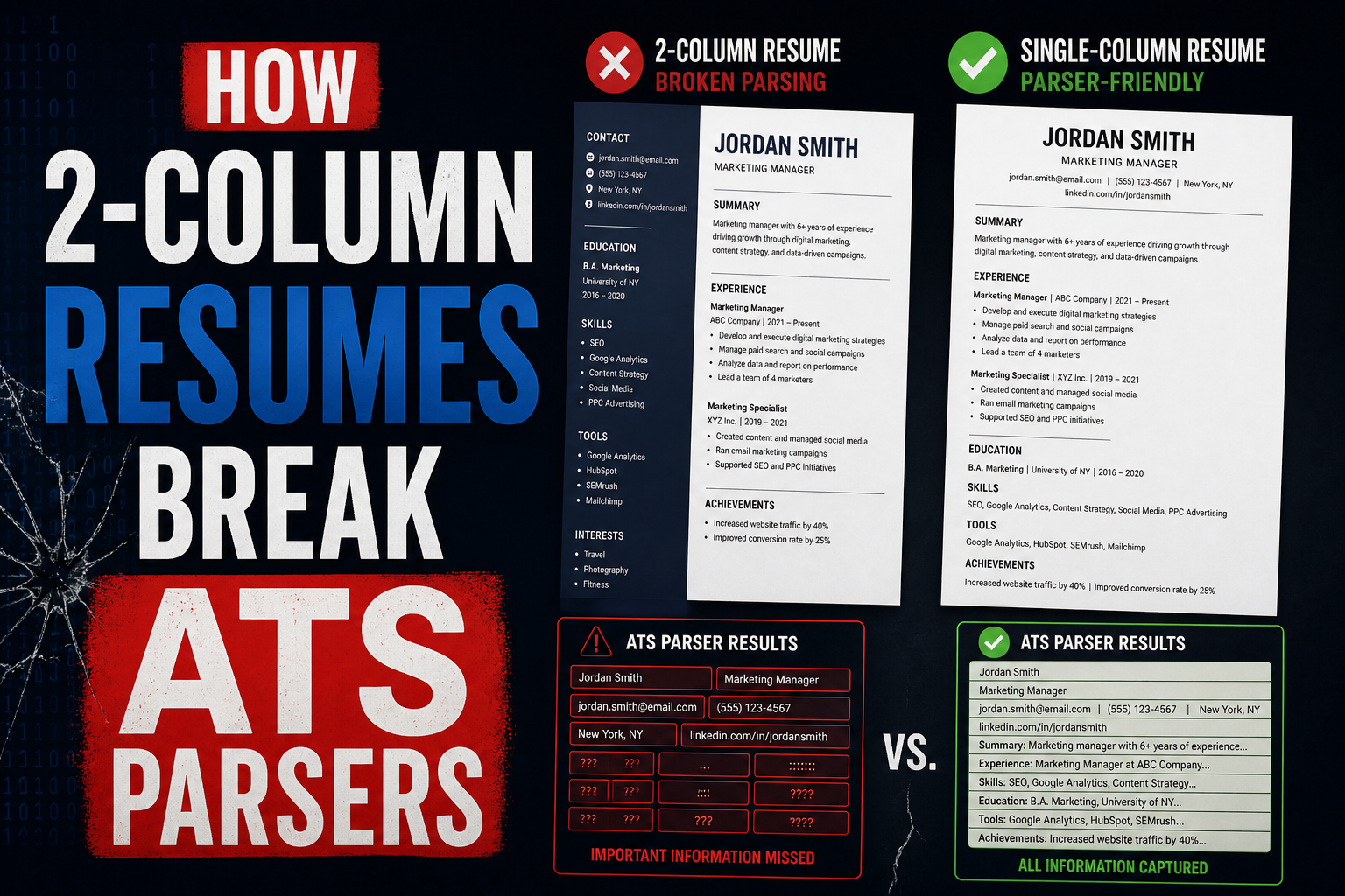
The breakdown is easiest to understand with a concrete example. Imagine a two-column CV where the left column contains: contact information, skills list, and education. The right column contains the work history. When the ATS parser processes this file, it may interleave the columns line by line.
Priya Sharma [left line 1] Senior Data Analyst [right line 1] priya@email.com [left line 2] Accenture, Mumbai 2021-2024 [right line 2] Python SQL Tableau [left line 3] Built real-time dashboards [right line 3]...
The parser has now stored a candidate record where the name, job title, email address, employer, and skills are interleaved in an order no human would ever produce. The recruiter’s ATS may display the current designation as “priya@email.com” because the email address ended up adjacent to the designation field in the extracted stream. The skills listed under the candidate’s profile may include years of experience (“2021-2024”) because dates from the work history got extracted into the skills field.
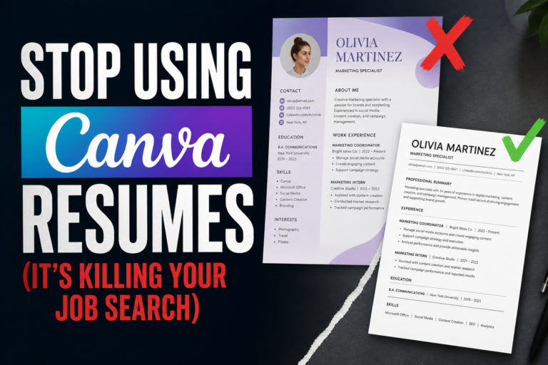
This is not a hypothetical edge case. It happens regularly with designed CV templates produced by Canva, Zety, Novoresume, and similar platforms. All of them default to two-column layouts because they look impressive visually. None of them were designed with ATS parsing as the primary constraint.
Naukri displays a parsed version of your uploaded CV to recruiters in its “Quick View” panel. If your CV uses a two-column layout and parses incorrectly, the Quick View shows scrambled information. Recruiters using Quick View to shortlist candidates will skip your profile without ever opening the original file. You are disqualified before anyone reads a single sentence you wrote.
Why this hits UAE and India applicants harder
In the US and UK, many companies use newer ATS platforms like Greenhouse, Lever, or Ashby, which have improved PDF parsing capabilities. They are not perfect with two-column layouts, but they handle them better than older systems.
The UAE and India job market relies heavily on Naukri, Bayt, GulfTalent, and Monster Gulf. These portals were built for volume, not for sophisticated document parsing. Their underlying parsing engines are older and more rigid. They extract text in a more literal way, without the layout inference that newer systems attempt. A two-column CV submitted to Naukri is more likely to parse badly than the same CV submitted to a modern US ATS.
There is also the volume problem. A recruiter at a large UAE or Indian company might receive 500 to 2,000 applications for a single role. At that volume, they rely almost entirely on what the ATS extracted and organised. They do not open original files for most candidates. They search the database, read the parsed Quick View, and shortlist from there. If your CV parsed incorrectly, you are invisible in that workflow.
Upload your CV to Naukri and check your own profile after the upload. Look at how your skills, designation, and work history appear in the parsed view. That is exactly what a recruiter sees when your profile comes up in search results. If anything is wrong, the format is the first place to investigate.
Which layouts work and which fail
Not all multi-column elements are equally damaging. The risk depends on what content is in the columns and how the columns are constructed technically. Here is a clear breakdown.
| Layout type | ATS parse risk | Verdict |
|---|---|---|
| Full two-column (work history in one column, skills/contact in the other) | Very high: work history and skills interleave | Avoid entirely |
| Three-column skill badges or icon grids | High: skills parsed as fragmented strings | Avoid entirely |
| Sidebar column with contact info, photo, social links | High: contact details merge with work history | Avoid entirely |
| Two-column header (name left, contact right) | Medium: depends on how header is constructed in the file | Use cautiously in DOCX only |
| Simple table for education (columns: degree, institution, year) | Low: short rows, clear field separation | Generally acceptable |
| Single column, top-to-bottom flow | Negligible: standard structure, full compatibility | Strongly recommended |
The header exception is worth noting. A simple two-column header in a DOCX, with your name on the left and your email and phone on the right, is common and usually parses acceptably because the header section is short and the ATS can identify the name and contact fields. The danger is when the two-column structure extends into the body of the document, especially the work history and skills sections.
What a well-structured single-column CV looks like
Single-column does not mean sparse or unsophisticated. It means every section flows vertically in a predictable structure. A well-designed single-column CV uses visual hierarchy through font weight, size, and spacing rather than spatial positioning. The result is clean, professional, and completely parser-safe.
The recommended section order for most roles in the UAE and India is: name and contact information, professional summary (three to four sentences), work experience (most recent first), education, and skills. For roles where skills are a primary differentiator, such as technology roles, skills can come before education.
Within the work experience section, each role follows a consistent structure: job title on one line, company name and location on the same or next line, dates on the same line as the company or immediately below, then three to six bullet points of responsibilities and achievements. Every element is in the same vertical column, read sequentially without ambiguity.
Two-column template
Left sidebar: photo, contact, skills, languages, certifications. Right main column: work history, education, summary. Looks polished. Parses as scrambled. Recruiter’s ATS shows garbled profile. Application ignored.
Single-column structure
Name and contact at top. Summary. Work history with dates and bullets. Education. Skills. Looks clean and professional. Parses perfectly. Recruiter’s ATS shows complete, accurate profile. Application reviewed.
Every CV generated by ApplyIn5 uses a single-column layout optimised for ATS parsing across all major job portals including Naukri, Bayt, and GulfTalent. The format is tested against the parsing engines of the portals that matter most for UAE and India job seekers, so you never have to think about whether your layout will survive the scanner.
Visual appeal vs functional performance
The objection most candidates have to single-column CVs is that they look plain. This is worth addressing directly, because it reflects a misunderstanding of when visual appeal matters in the hiring process.
Visual appeal matters when a human is looking at your CV and forming an impression. That moment happens after the ATS has processed your application, after a recruiter has run a search and your profile appeared in results, and after the recruiter has decided to open your file. That is at minimum step three or four in the process. Every step before that is entirely functional. A beautiful CV that fails steps one and two never reaches the human at step four.
When a recruiter does open your CV file, a clean single-column layout reads faster than a two-column design. Recruiters move between CVs quickly. They want to find your role, your company, your tenure, and your top two or three bullet points in 30 seconds. A single-column layout puts all of that in the expected place. A two-column design requires the eye to navigate between two visual tracks, which slows reading at exactly the moment the recruiter is most likely to move on.
The practical conclusion: a single-column CV that parses correctly and contains strong, specific bullet points will outperform a two-column design in every stage of the hiring process. The design is not the differentiator. The content is. For more on how your application volume, callback rate, and CV quality all interact, read the job application math breakdown.
A CV is not a portfolio piece. It is a data document. Optimise it to be found and processed correctly. The recruiter who calls you for an interview does not remember what your CV looked like. They remember what your experience was.
Frequently asked questions
- Do all ATS systems fail to parse two-column CVs?
- Not all, but enough that the risk is not worth taking. Newer platforms like Greenhouse and Lever handle formatted PDFs better than older systems. The ATS engines behind Naukri and Bayt are less forgiving. Since you often cannot know which system a company uses, defaulting to a single-column layout eliminates the risk across all scenarios.
- Can I use a two-column layout if I am applying directly via email?
- If your CV goes directly to a human without passing through an ATS, the format risk is eliminated. Small companies in the UAE that hire through direct email or referrals often do not use ATS platforms. In those cases, a designed two-column layout may be appropriate. The problem is that you often cannot know whether a company uses ATS until it is too late to change your application.
- What about using Word’s built-in column feature instead of text boxes?
- Word’s built-in column feature creates true document columns that some ATS systems handle slightly better than absolute-positioned text boxes. But even native Word columns are not reliably parsed in the correct reading order by all ATS platforms. Single-column remains the safest choice regardless of how the columns are technically constructed.
- Is there any situation where a two-column CV is the right choice?
- For printed CVs at a career fair or networking event, where a human will read it directly, a two-column design can be visually effective. For portfolio submissions in creative fields where design is part of the evaluation, a designed layout makes sense. For any application submitted through an online portal, including Naukri, Bayt, LinkedIn, GulfTalent, or any company ATS, single-column is the right choice.
- How long should my single-column CV be?
- One page for under 5 years of experience. Two pages for 5 to 15 years. Beyond 15 years, two pages with careful editing to keep only the most relevant roles. Single-column does not mean fitting everything on one page at font size 8. White space and readable margins matter. A clean two-page single-column CV is better than a cramped one-page two-column design.
Stop losing interviews to a layout problem.
ApplyIn5 generates ATS-optimised, single-column CVs tailored to each job you apply for. The format is always right. The content is always relevant. The application always reaches the recruiter.
Apply smarter, get hired faster →